SQLMonitor Adds Graphical Query Plans!
The SQLMonitor team at Redgate has been releasing updates at a much more rapid rate…what’s this mean to you? More fixes and more features. In this latest release, they certainly added something special…Graphical Query Plans! Yes, right inside of SQLMonitor’s user interface. Why is this important? Well for me, when I’m troubleshooting a performance issue…I usually start with identifying what system resource is being taxed and try to zoom in from there on the root cause. Now lets say the root cause is a poorly performing query, SQLMonitor let’s you find that query pretty easily, but stopped short when it came to diagnosing that actual performance issue in the query.
In this article I’m going to show you how to drill down to find a graphical query plan for a poorly performing query!
In full disclosure, I’m a Friend of Redgate…but I can tell you this, I’ve been using SQLMonitor for a lot longer than I was a FoRG. I truly believe it’s a great product.
First up, download the new SQL Monitor latest release – here
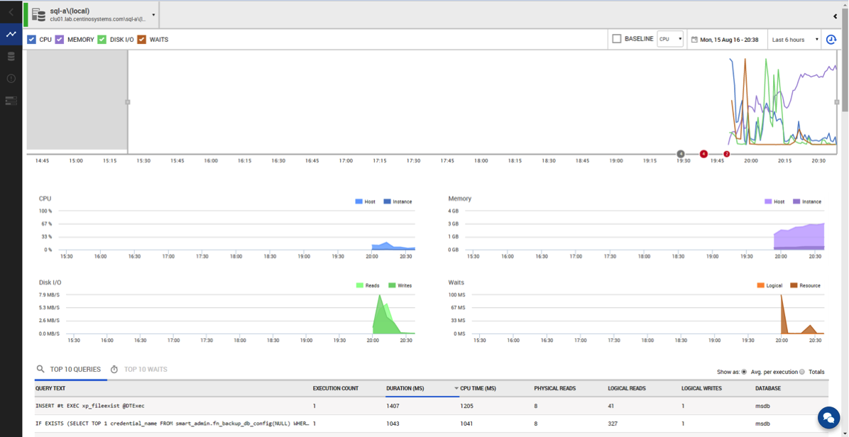
Once installed and you’ve collected some data, navigate to the new server overview page by clicking on your server’s name. A couple things I want to point out to you on this page, first you get a clear layout of the critical system resources, CPU, memory and disk I/O, also included is Waits…all crucial information. With this you will be quickly able to determine if there is a resource problem. All the menus have context, so when you click on that spike in the CPU chart, the rest of the data on the page will change and adjust their data to that point in time.

Figure 1: New Server Overview
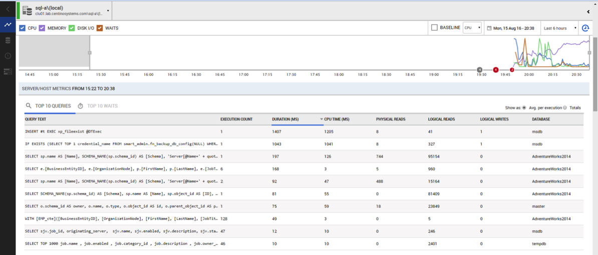
Right below resource charts, there’s the list top 10 queries, this view has always been my go to spot to find “that query” that’s performing poorly. And since the data is all zoomed in on the point in time we clicked on in the previous chart we can sort the query list by CPU, physical or local I/O and both by average or total usage gives you the ability to quickly sort through tons of data and sift out that one query.

Figure 2: Top 10 Query List
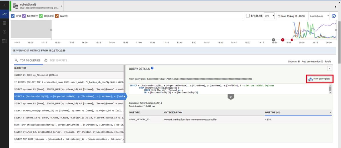
Now, once that we’ve zoomed in on “that query” causing you grief, you can select it on the left in the list by clicking on the row in the “query text” and that will bring up the query details on the right. With that window up, you get the full query text, any query level waits, and a plan hash to pull the query plan from the plan cache. But in the latest release of SQLMonitor there’s now a “View Query Plan” button. CLICK THAT!

Figure 3: Query Details
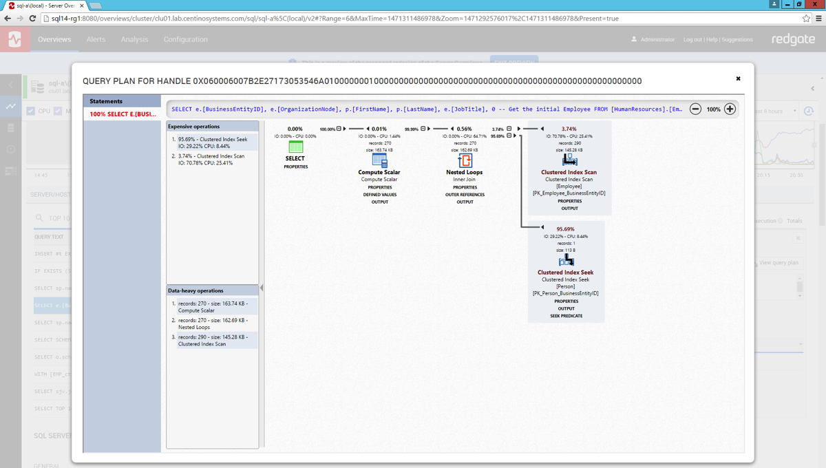
Now you get a graphical query plan highlighting what just happened! Prior to this version SQLMonitor would get you all the way to this point and we had to grab the query hash and take that back into SSMS or other products for graphical analysis…that can be time consuming.

Figure 4: Graphical Query Plan!
With this new functionality, SQLMonitor takes you all the all the way through your troubleshooting workflow from the reporting of your issue, enabling you to very quickly sift out the performance anomaly and help identify it’s cause.